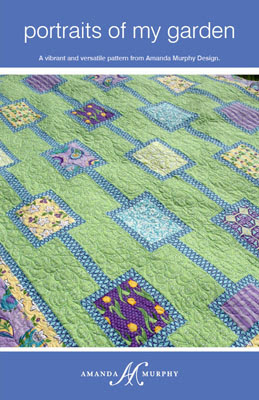
While I’m waiting for my patterns to come back from the printer, I’d like to introduce you to another design, “Portraits of My Garden”.

This quilt is really quick and fun to sew – probably the easiest of all the quilts in my line. My goal was to design a piece that would showcase feature prints in large “framed” pieces, hence the name of the quilt. I also wanted to explore having a color, rather than white or cream, function as a neutral background.
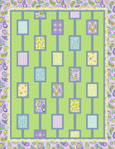
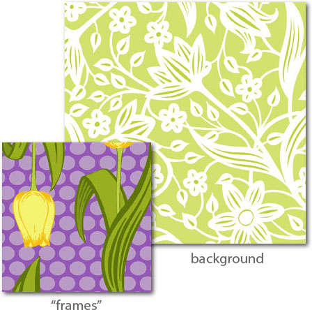
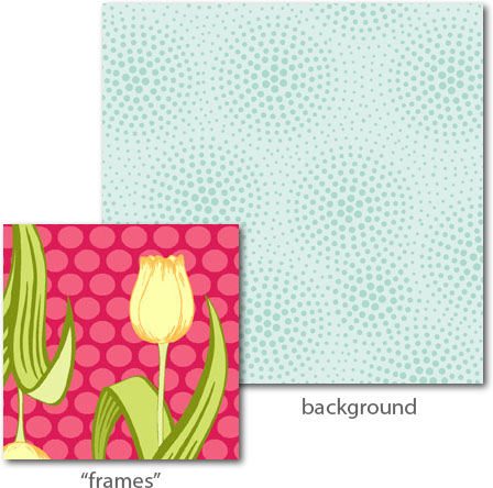
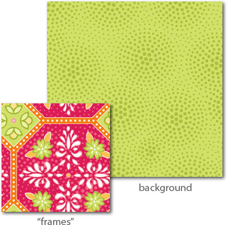
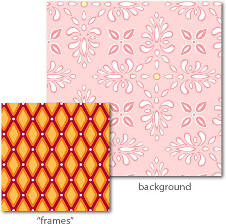
The key is picking a fun tone on tone pint for the background, with a contrasting bolder print for the “frames”. (You could also pick a solid for either, but we are probably too accident-prone around here to have that work for us.)
The large feature prints are showcased framed up as “portraits”.
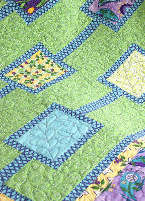
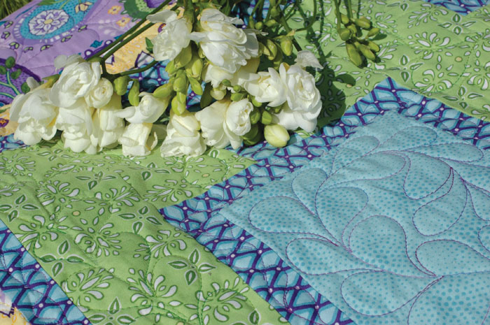
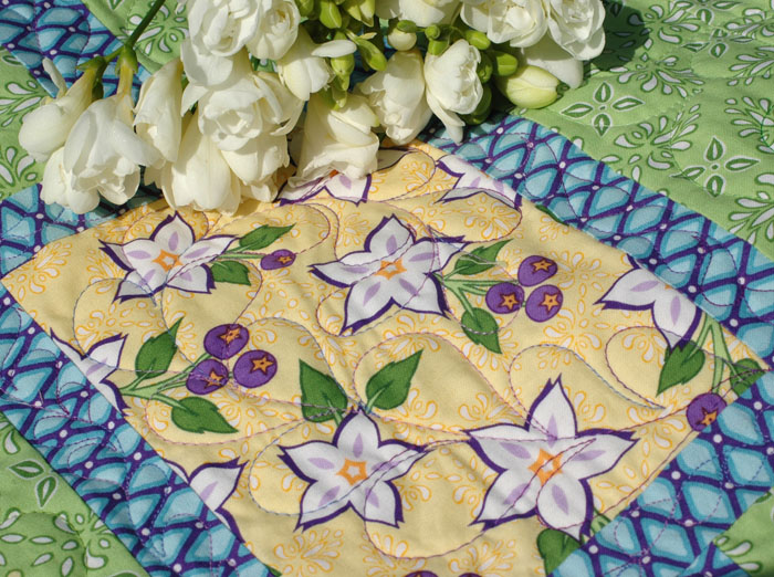
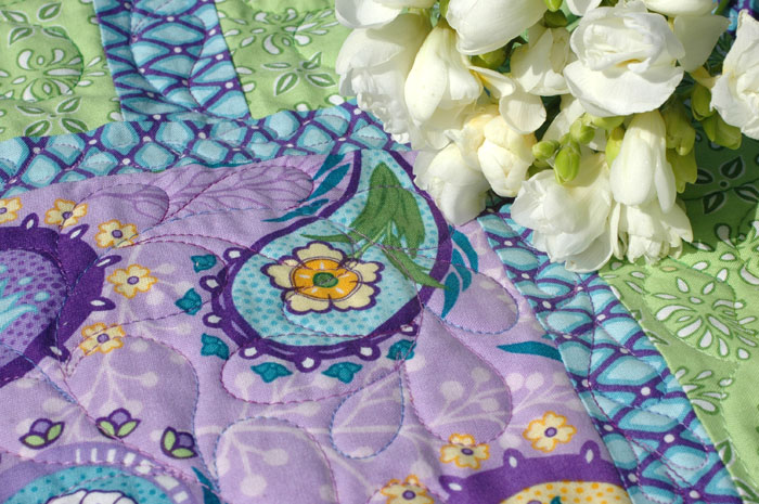
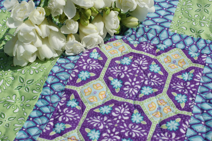
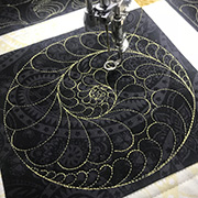
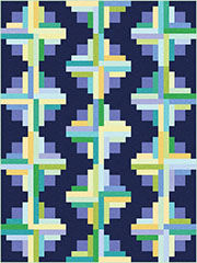
I love how Deborah Norris echoed the feathers she quilted down the center of the columns in each individual block. I chose the medium green creamware print for the background and the purple and aqua geometric diamonds for the “frames” in the sample.
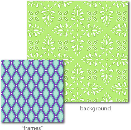
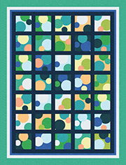
Here are some other possible color combinations for backgrounds and “frames” from Veranda:
Again, Fat Quarter Shop will have this pattern in just a few weeks. If you are a shop owner, please contact me directly to arrange an order and/or to be listed as carrying the patterns.
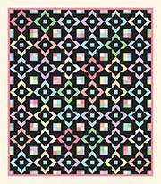
My friend Mary tested this pattern for me in Ambrosia. Take a peek!
Happy sewing!
Amanda